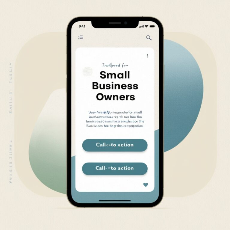
Mobile-optimized website for small business owners
Why a Mobile-Optimized Website is Crucial for Small Business Owners in 2025
In today’s fast-paced digital landscape, having a mobile-optimized website is no longer just an option—it’s a necessity. As mobile usage continues to dominate, small businesses that neglect mobile optimization risk losing customers, revenue, and visibility online. This blog will explain why a mobile-friendly website matters and provide actionable tips to ensure your business stays ahead in 2025.
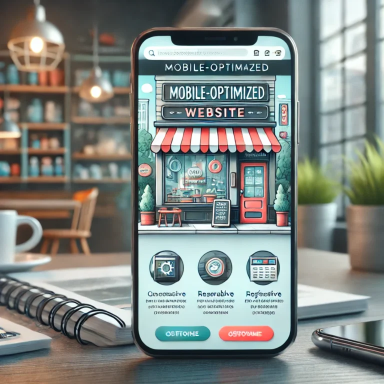
What is a Mobile-Optimized Website?
A mobile-optimized website is designed to provide an excellent browsing experience on smartphones and tablets. This means:
Text is readable without zooming.
Navigation is intuitive, with buttons that are easy to tap.
Pages load quickly, even on slower mobile networks.
Content automatically adjusts to fit any screen size.
Why Your Small Business Needs a Mobile-Optimized Website
1. Mobile Traffic Dominates
Over 70% of website traffic now comes from mobile devices. If your site isn’t optimized for mobile, you’re alienating a significant portion of potential customers.
2. Google Prioritizes Mobile-Friendly Sites
Google’s algorithms prioritize mobile-optimized websites in search results. If your site isn’t mobile-friendly, it’s less likely to rank well, making it harder for customers to find you online.
3. Better User Experience = More Conversions
A website that’s easy to navigate on a smartphone keeps visitors engaged and reduces bounce rates. Happy visitors are more likely to convert into paying customers.
4. Competitive Advantage
Many small businesses still overlook mobile optimization. By upgrading your website, you gain a competitive edge and show customers you’re committed to providing the best experience.
How to Check If Your Website is Mobile-Optimized
1. Use Google’s Mobile-Friendly Test
This free tool analyzes your website and highlights any mobile usability issues. It’s a quick way to see where improvements are needed.
2. Test Your Site on Multiple Devices
Open your website on different smartphones and tablets. Check for issues like text size, button functionality, and overall layout.
3. Monitor Loading Speed
Mobile users expect websites to load in under 3 seconds. Use tools like PageSpeed Insights or GTmetrix to measure and improve your site’s speed.
Steps to Optimize Your Website for Mobile
1. Use a Responsive Design
A responsive website automatically adjusts to fit any screen size. Most modern website platforms, like WordPress, offer responsive themes.
2. Simplify Navigation
Keep menus and navigation simple and easy to use. Ensure critical information like contact details and service descriptions are easily accessible.
3. Optimize Images
Large images can slow down your website. Compress images and use formats like WebP to improve loading times.
4. Enable Click-to-Call
Make it easy for visitors to contact you by enabling click-to-call buttons for your phone number.
5. Test Forms and Features
Ensure any forms, booking systems, or interactive features work seamlessly on mobile devices.
6. Regularly Update Your Site
Technology evolves quickly. Regularly review and update your website to keep it mobile-friendly and aligned with current standards.
The Benefits of Mobile Optimization for Small Businesses
Increased Traffic: Capture the growing number of mobile users.
Higher Search Rankings: Improve your visibility on Google and other search engines.
Enhanced Customer Experience: Build trust and credibility with a professional, user-friendly site.
Boosted Sales: Make it easy for visitors to browse, contact, and purchase from you.
Conclusion: Don’t Get Left Behind
In 2025, a mobile-optimized website is the foundation of your online presence. It’s not just about keeping up with trends; it’s about meeting your customers where they are and providing the experience they expect. By investing in mobile optimization, you’ll attract more customers, improve your search rankings, and grow your business.
Ready to take your website to the next level? Let’s get started!